Aesthetics of Graphic Resistance and Typeface in the Service of National and Religious Identity
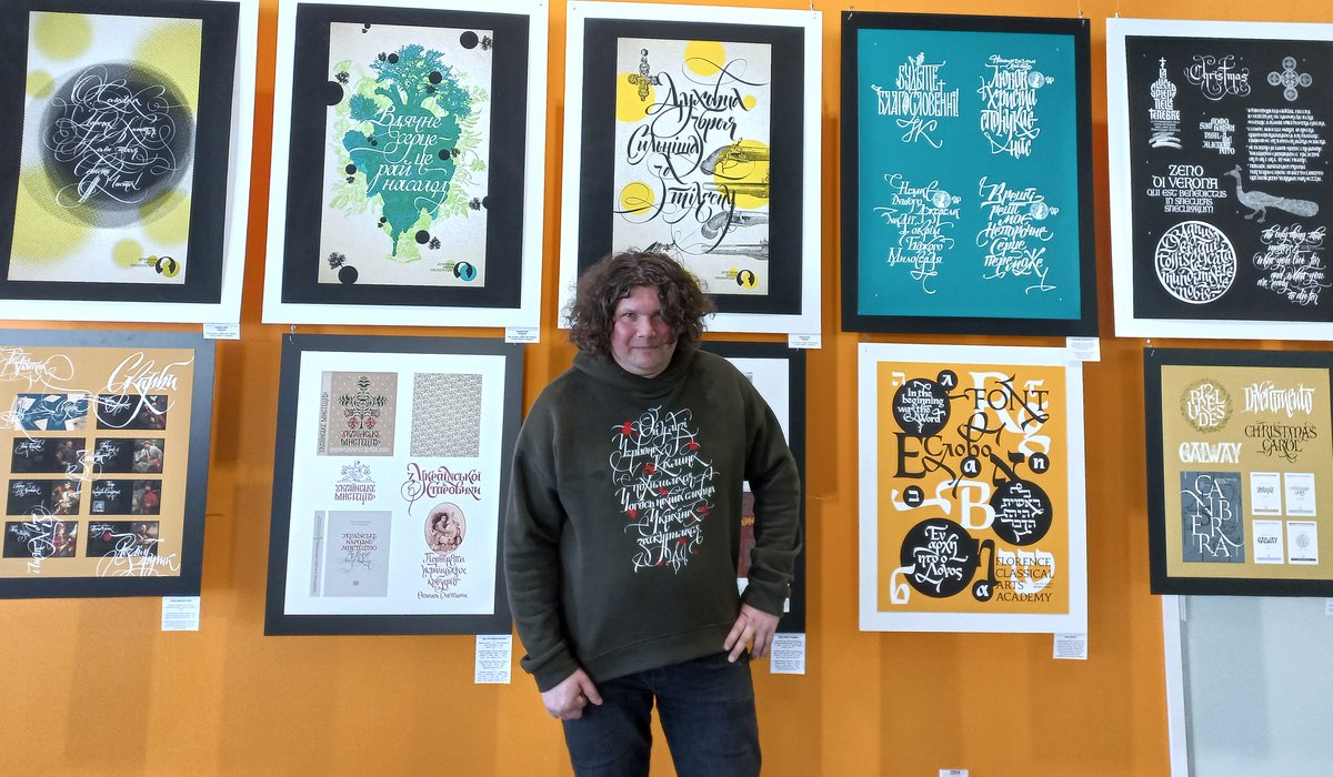
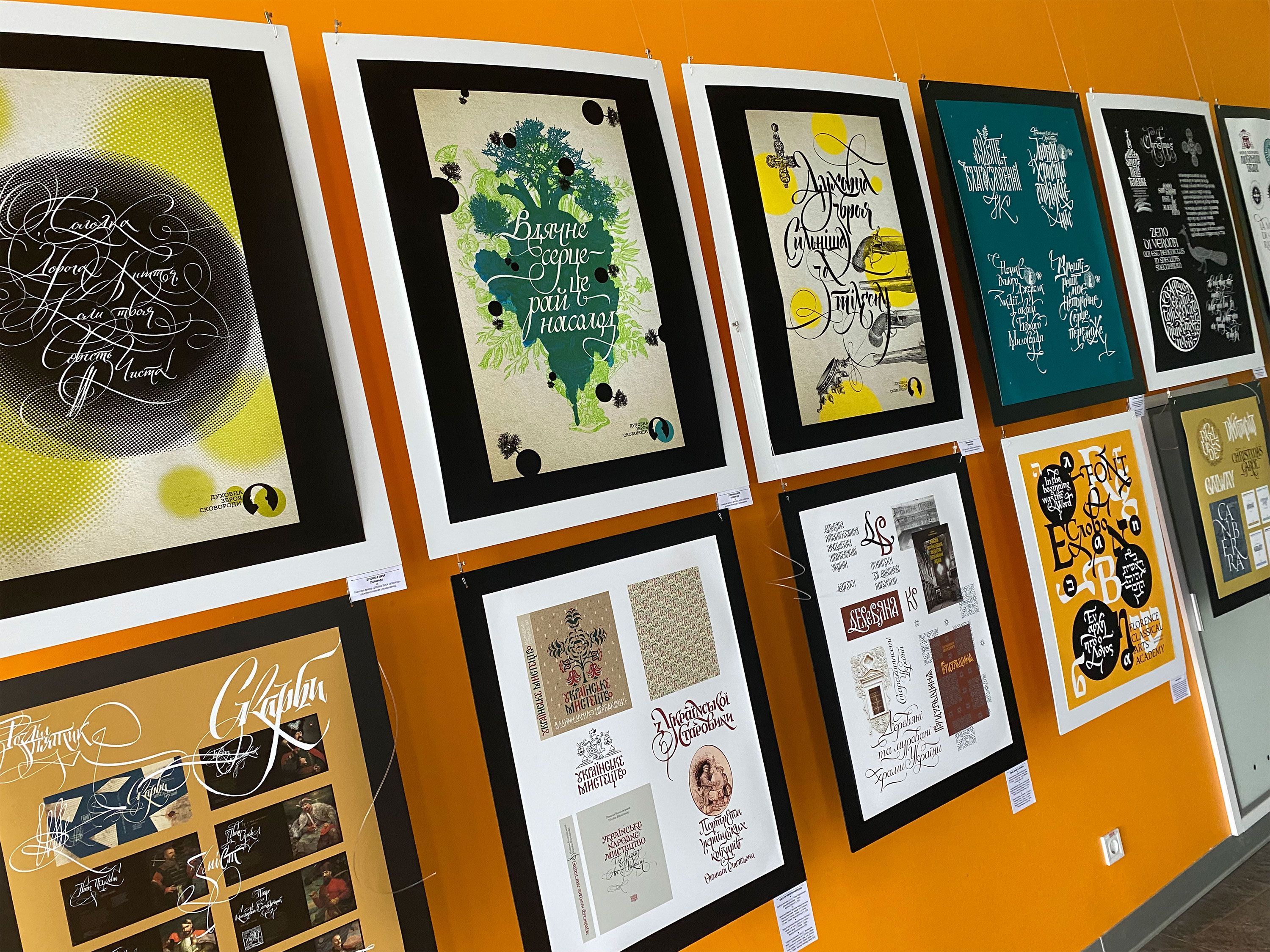
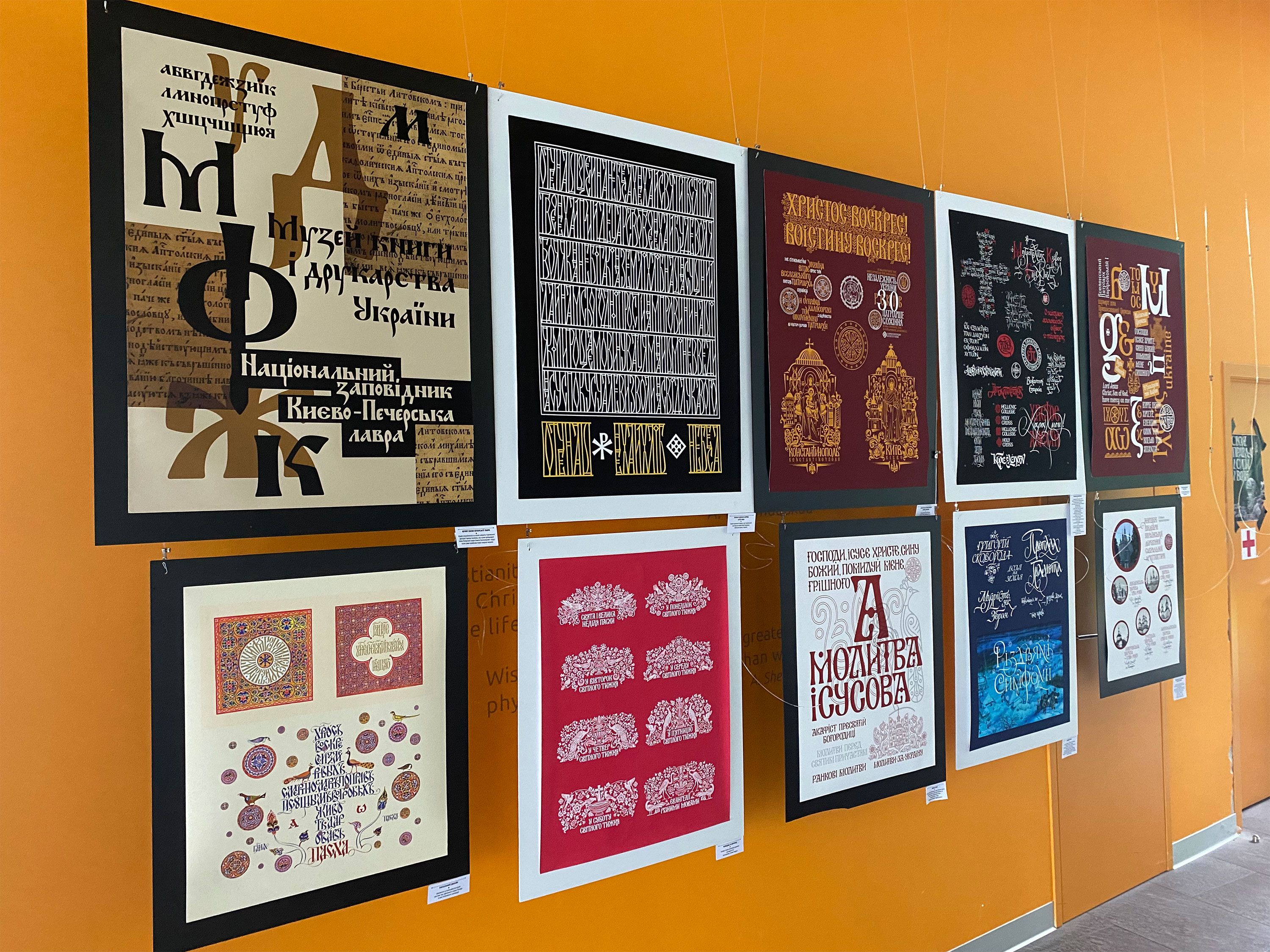
Oleksiy explores the history of typeface art and the manuscript traditions of various writing systems. He is also deeply interested in the history of early Christian and medieval art in Byzantium, the Middle East, and Europe. At the Sheptytsky Center at UCU, his exhibition "A Gaze Beyond the Horizon: Letters Speaking of Freedom and Faith" is ongoing. The author presented works in the field of free calligraphy, book design, pen design, and graphic images for various Christian denominations and churches. Through typographic aesthetics, Oleksiy Chekal skillfully conveys ideas of freedom, faith, and national identity. The exhibition was held in the lobby of the Sheptytsky Center until June 14th inclusive.
"Why did you choose these particular works for the current exhibition?"
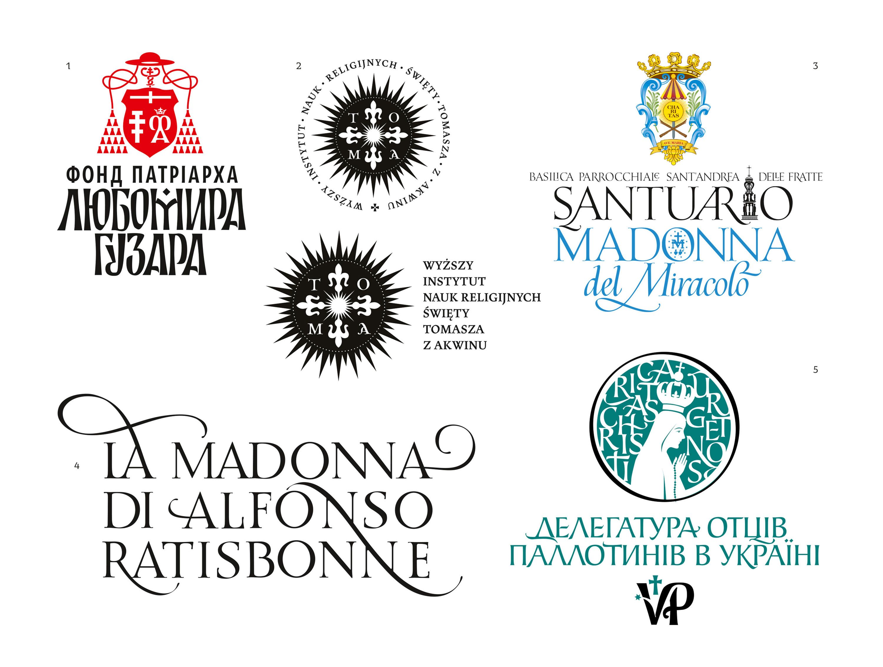
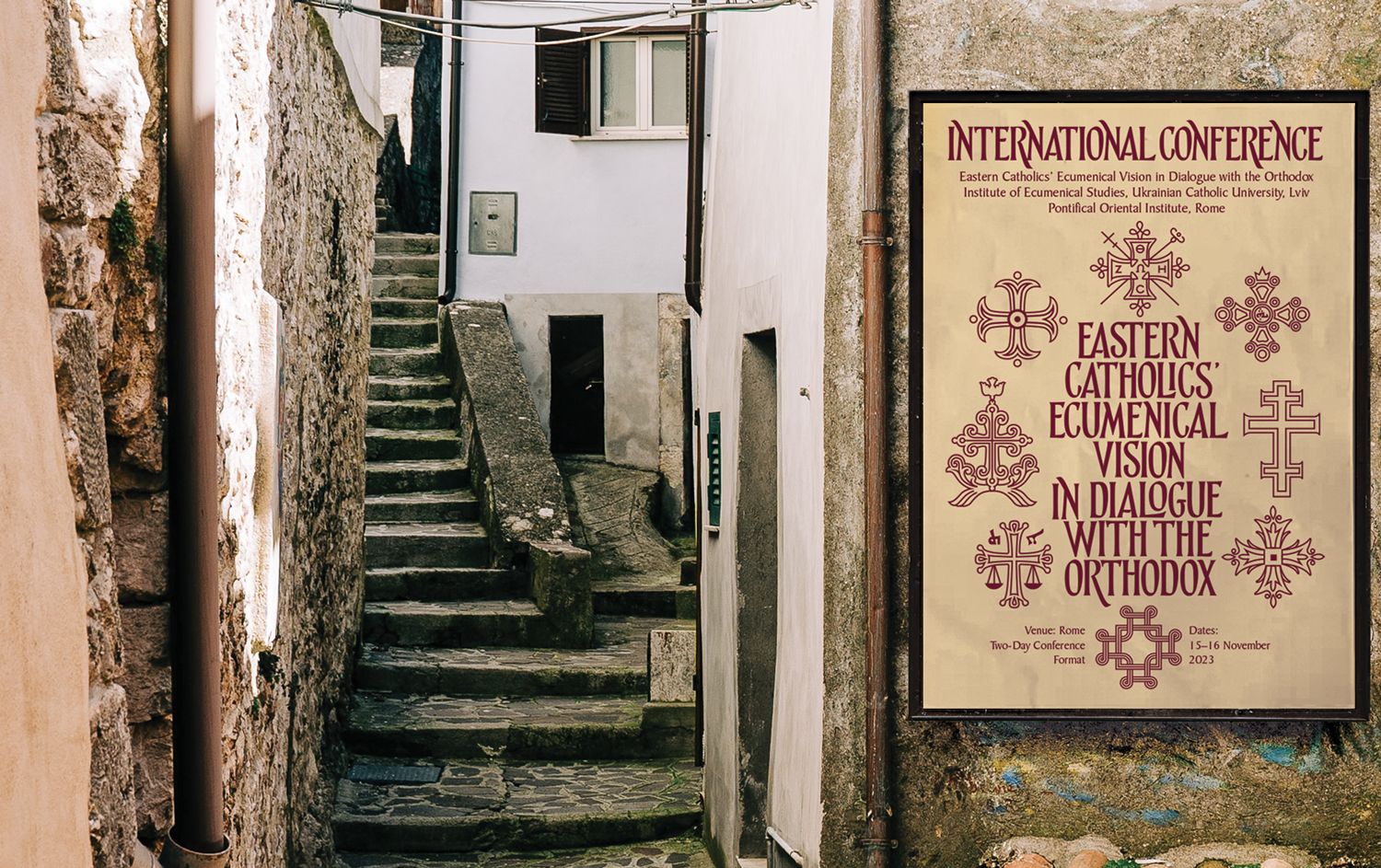
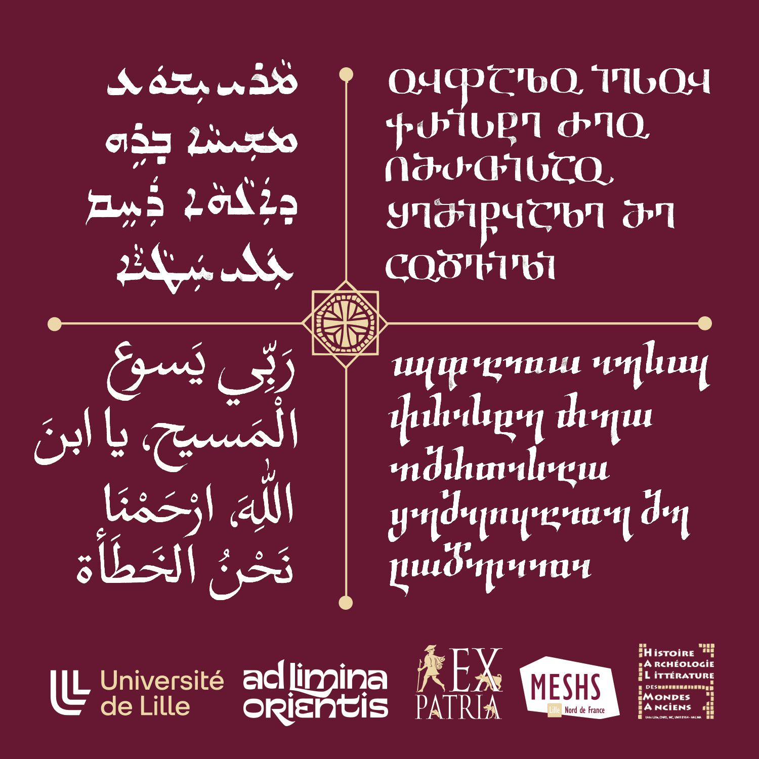
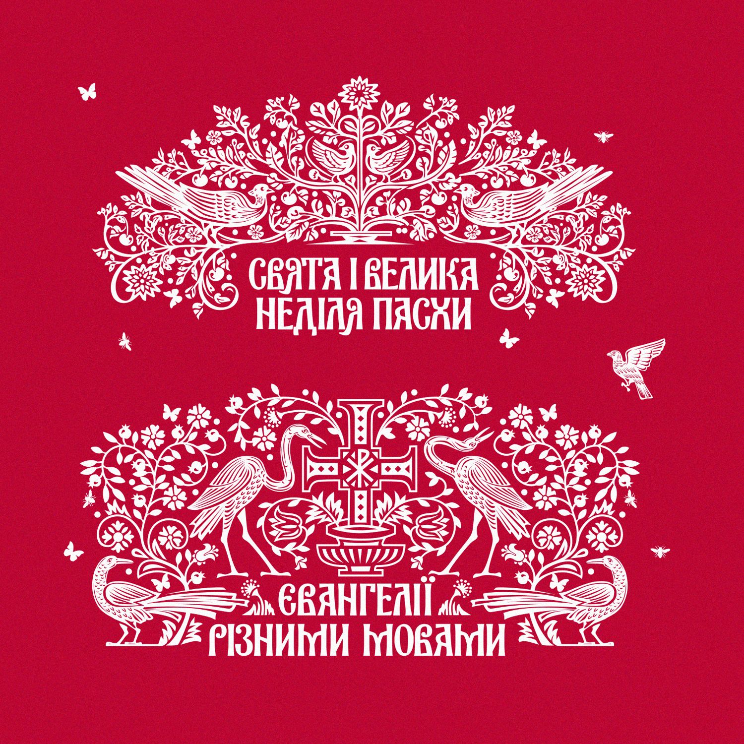
"I chose a selection of works that highlight interreligious connections. There are projects made for different faiths. I work extensively with the Orthodox Church of Ukraine, developing its graphic style, fonts, publications, and logos for various dioceses and parishes, starting from the design for the Unification Council of 2018. Specifically, in these works, I sought the flourishing aesthetics of Ukrainian Christianity and attempted to drift away from imperial influence in ornamentation and fonts, which, unfortunately, were subconsciously used during a certain period of history. On the other hand, I have worked a lot in Italy with the Catholic Church, I have been cooperating with Ukrainian Roman Catholics, and I have completed several interesting projects with Greek Catholics, in particular with the Ukrainian Catholic University. I give particular attention to the Eastern Churches, with a strong emphasis on the traditions of the Syriac rite With this in mind, I have spent many years studying and assisting in Eastern Studies at Dmytro Tzolin's studio. Currently, he teaches at UCU and works on the excellent 'From a word to the Word' project, for which I also did the design." I find it very interesting to work with different worldviews, discovering each time certain typographic, aesthetic, and sacred correspondences. It allows me to reflect, on one hand, religious identity and, on the other hand, to emphasize the Ukrainian narrative through artistic language.
There are also several works here related to Hryhorii Skovoroda, with his idea of freedom and liberty. At this exhibition, calligraphy featuring his quotes is presented, which was created for the museum in Skovorodynivka, destroyed by Russian rockets at the beginning of the war. It seems to me that it is through Skovoroda's philosophy, the idea of love and freedom, that it is important to convey our identity. His philosophy of the heart is very apt and important for us now.
"During one of the presentations, you mentioned the need to move away from perceiving Ukraine as a post-imperial society." As for me, your fonts have references to the time of the Cossacks. "As a researcher of the past and as a creator of the new, how do you define the boundary between our authentic identity and what has been imposed on us?"
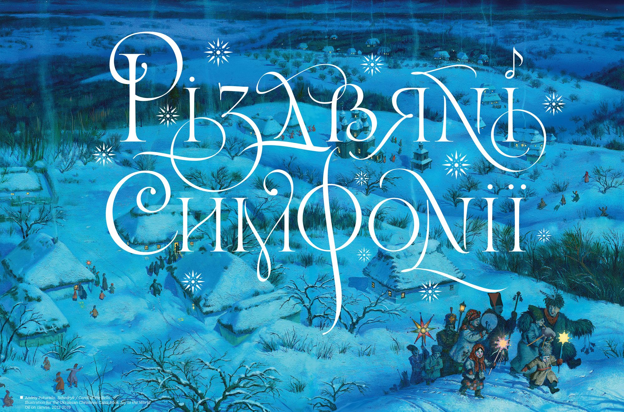
"The typefaces from the Cossack era that I use reflect the free Cossack spirit, not an imperial worldview." These fonts are significantly influenced by Greek and Latin calligraphy. Therefore, they resonate with Ukrainian identity. But it's not just about the form; it's also about the context of design and the meanings we put into each project. For example, here is a piece created for the 'Ababahalamaga' publishing house together with my late friend Andriy Poturaylo, dedicated to Ukrainian Christmas: 'A New Joy Has Come. Favorite Christmas Carols and Shchedrivkas.'" In the illustrations and calligraphy that reference Gogol's worldview, we strive to avoid the influences of Russian occupation during those times and instead highlight our national existence in the 18th and 19th centuries.
"At this exhibition, there are also projects related to the revival of fonts that existed in our territories before Peter's reforms, which gave rise to the so-called 'civil script.' This includes the development of font systems used in the first editions of the Kyiv-Pechersk Lavra printing presses, a project we are working on jointly with the 'Museum of Books and Printing of Ukraine.'"
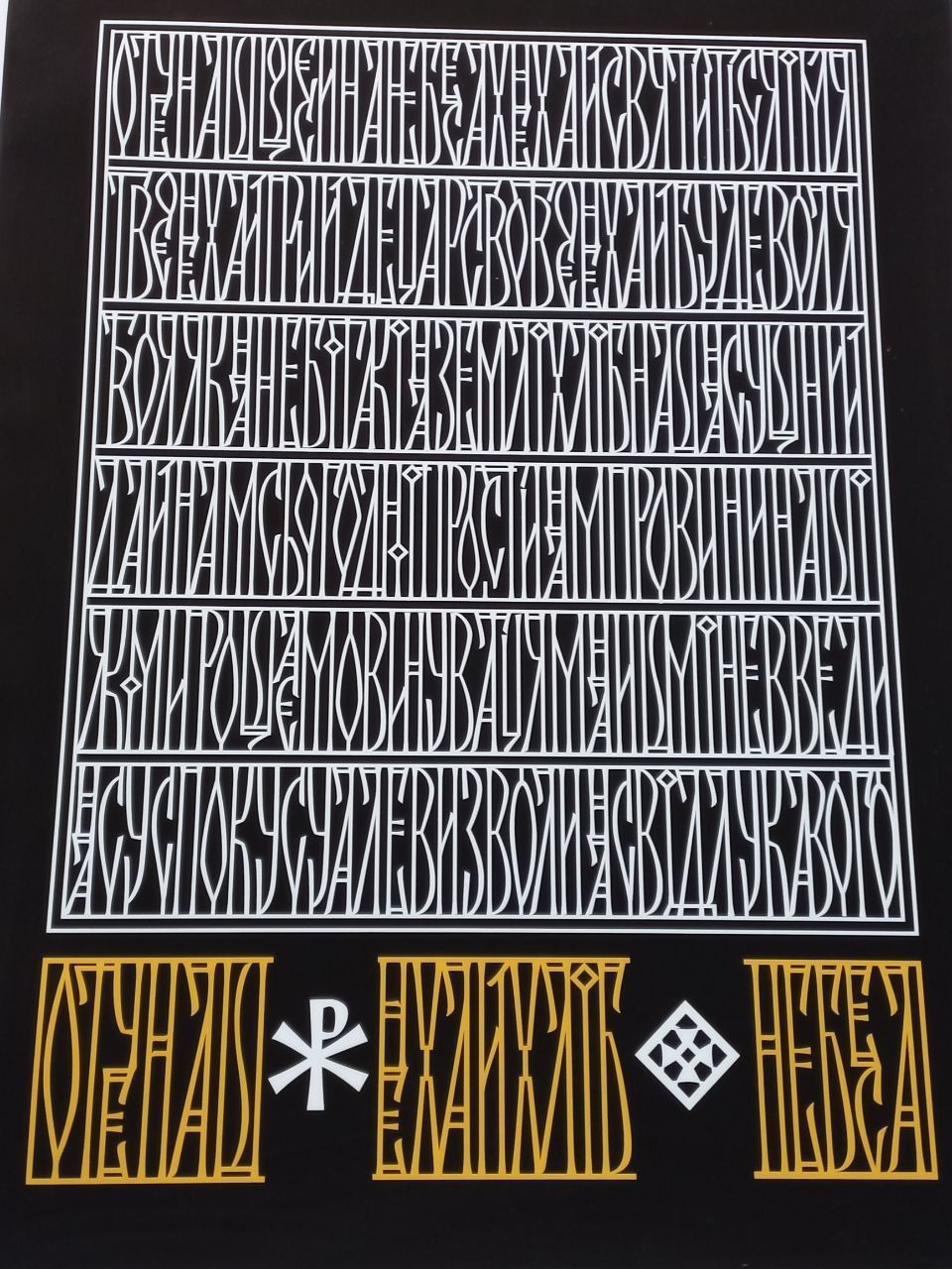
I am also interested in avant-garde design trends. For example, a fence for a church in Kharkiv with the text 'Our Father,' made in the spirit of Yakiv Hnizdovsky. They have many experiments at the intersection of different eras and styles. It seems to me that the principle of Ukrainian identity, as my good friend typographer Andriy Shevchenko says, is 'let all flowers bloom.' In other words, we need to look for many sources of inspiration from history but turn them into the present. As our well-known Kharkiv scientist Yuriy Shevelev said: "the world will perceive us only as modern." And the world is now very interested in what is happening in our country. An example can be the success of the publication 'Ukraine Rising: Contemporary Creative Culture from Ukraine' (gestalten/CP Publishing), which includes my works in the collection of contemporary Ukrainian art.
"How can your works and fonts, calligraphy, and graphics generally affect the construction of a dialogue between different faiths?"
"Empathy is important when you are trying to immerse yourself in the tradition in a high-quality way. Then people from different Christian denominations trust you, realizing that you will not repeat yourself and impose the aesthetics of your previous work. Therefore, it is, on the one hand, empathy on the part of the creator and, on the other hand, trust on the part of the customer. They create grounds for the dialogue. Artists can get along faster than theologians because the language of beauty is more understandable to everyone. I call this "cardiodesign" in the context of Skovoroda's "philosophy of the heart".
The Catholic theologian Hans Urs von Balthazar wrote in his Theoesthetics that beauty can cross boundaries and create connections where people and ideas disagree. Orthodox philosopher and theologian David Hart clarifies that beauty eliminates our differences, questions them and demonstrates the harmony of the universe."
"Your work is always diverse. How can you develop something unique for each order? Who inspires you?"
"These can be historical sources, calligraphers of ancient manuscripts, or, for example, church decorations, scribes of the Cossack era. And the aforesaid Skovoroda, he had a wonderful handwriting. I am exploring it, writing articles about it, and taking it as a basis. And, of course, I draw inspiration from those designers who worked in the twentieth century. There were a lot of them in the diaspora: Yakov Hnizdovsky, Pavel Kovzhun, Robert Lisovsky and others. Interestingly, in the diaspora, artists retained more features inherent in the Ukrainian aesthetic outlook because inside the state, the gray Soviet system had its influence, and artists were more constrained.
And, of course, our friends, with whom we have been working since the 2000s and trying to develop the history of type art, inspire us: Andriy Shechenko, Kyrylo Tkachov, Dmytro Rostvortsev, Viktor Kharik, Vika and Vita Lopukhina, Natalia Komiakhova, and others.. Now, we can say there is a boom in both calligraphy and font making. Even at the state level, there is an understanding that fonts are a very important part of visual culture and identity.
"You can often hear that such things are not relevant because there are active military operations, and everything related to them requires urgent attention. Tell me, why do you think we should also work in the cultural field?"
"Of course, military resistance is more important because if we do not stand here, there will be no future. But semantic resistance helps Ukrainians understand that fighting not only for land, but also for history and culture is necessary. For example, we know that "boychukists" and many other Ukrainian designers of the twentieth century were shot for Ukrainian aesthetics. And, it would seem, what is there such a thing: letters, a little other images. But this is important for the occupier because it is a marker that we are trying to be different and defend our vision of the world.
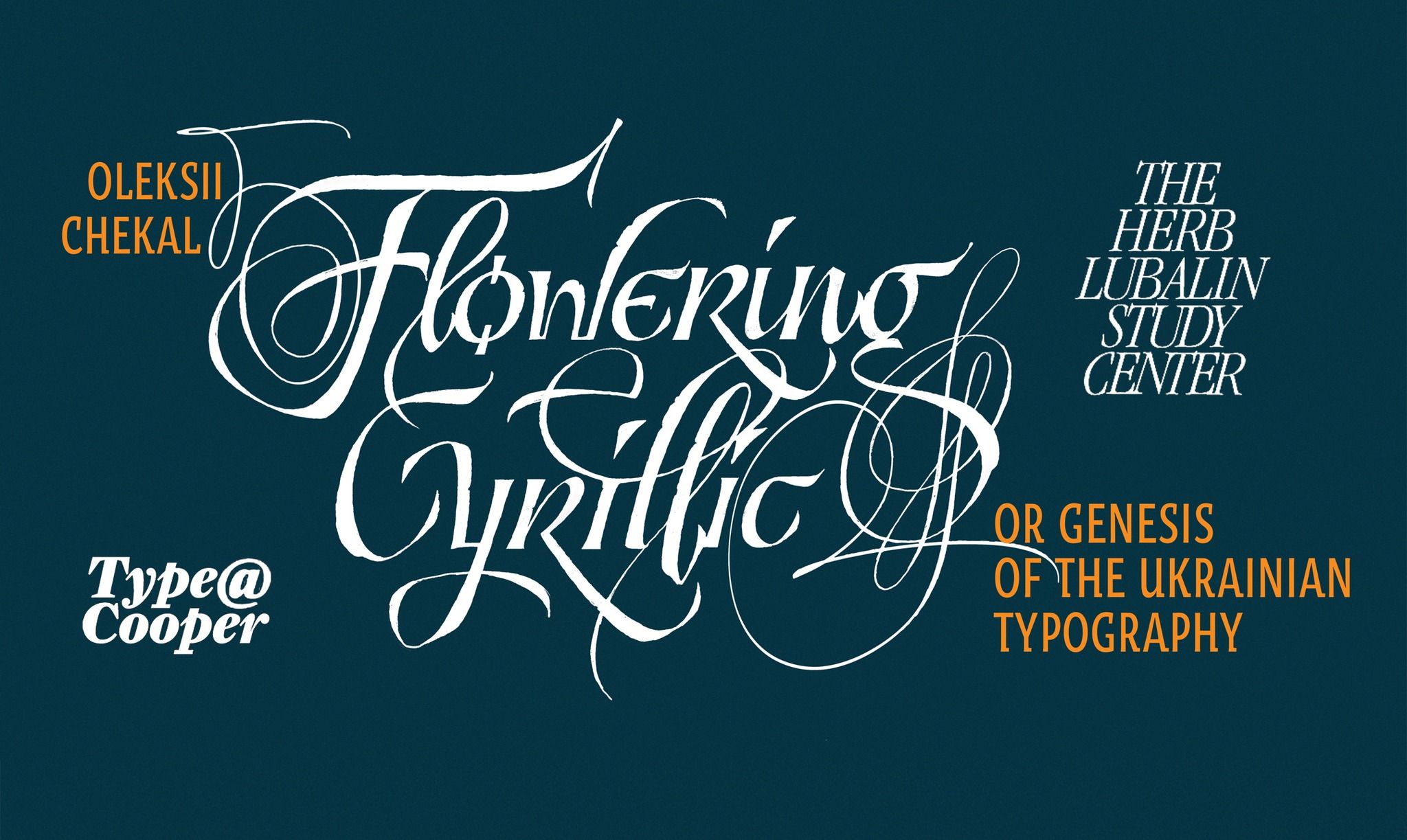
I also know quite a lot of designers who were included in the execution lists of modern warfare. If Kharkiv or other cities were captured, many would no longer be in the world. Among them are my friends. Similarly, my activities in the development of Ukrainian art and the church are quite "exciting and upsetting" for the Russian entities because they detect an enemy in individualism, talent, powerful influence on aesthetics, and the ability to defend dignity. We are also being killed for letters, for our vision of art. I talked about this at the very famous design site Herb Lubalin Lecture Series & The Cooper Union in New York. This is probably the first time that the anti-colonial history of Ukrainian writing and the font «Flowering Cyrillic or the Genesis of the Ukrainian Typography» was presented to the English-speaking public.
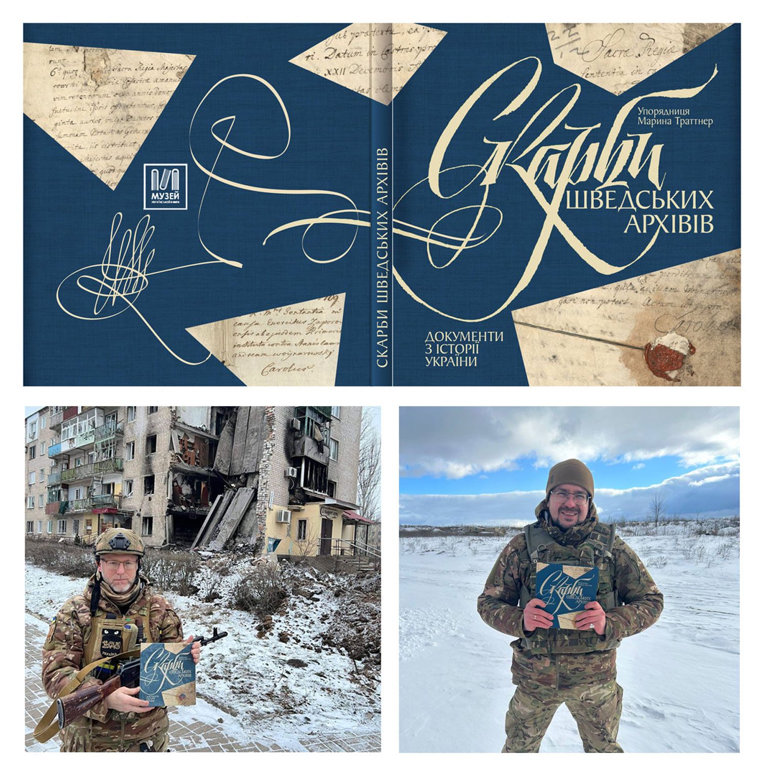
Therefore, there must be people who form the worldview. Historians who tell the true history of Ukraine or Ukrainian Art. Even about the fact that we failed, as in the time of Mazepa, but how we still tried to build a state. By the way, the book "Treasures of the Swedish Archives", which we, together with Ukrainian and Swedish historians, made on the basis of documents from Sweden under the leadership of Marina Trattner, is very common among the military. They read about facts from our history and try to avoid mistakes and finally defeat the enemy this time.
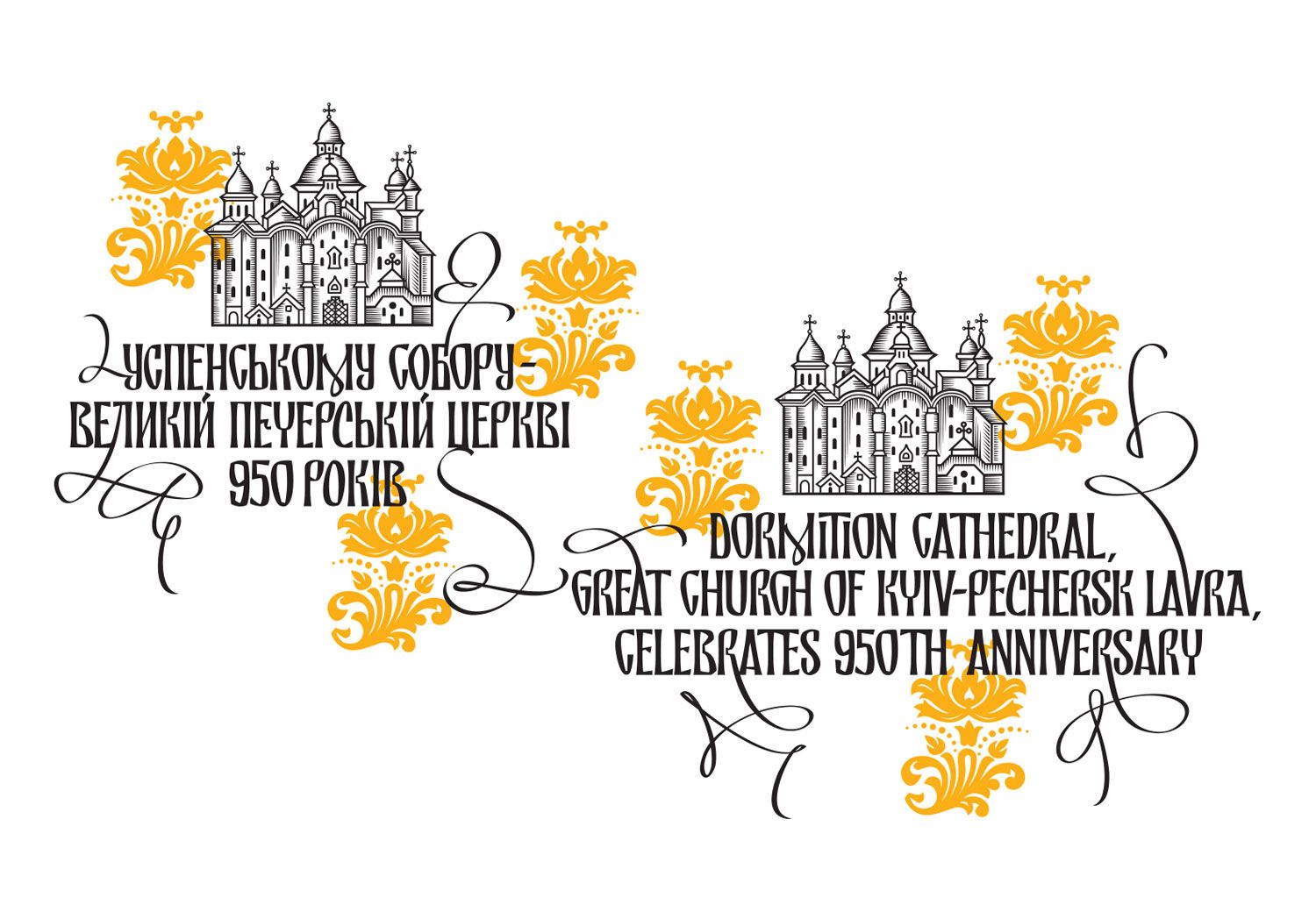
I am now involved in the projects of the Kyiv-Pechersk Lavra nature reserve, where we are trying to return the Ukrainian Lavra to Ukraine and snatch this shrine from the clutches of the Russian ideology of the Russian Orthodox Church. The Reserve is engaged in the return of history and meanings and rehabilitation of the military. It is there that they listen to the true story, which is connected with the aforesaid Mazeppa, with the Saints whose relics lie in caves, understand how the Princes of Ostrog, Olelkovichi or other military and cultural figures acted in the state plan, and realize what they are fighting for now. This is very important. You might think that people who are engaged in cultural and educational projects are not so much in demand now. But this is not the case. The military is fighting and defending our right to our own culture and identity, and historians who are now in the army are engaged in forming the historical consciousness of soldiers. Among them are such historians as Oleksandr Alfyorov, Igor Poluektov, Borys Cherkas, Yevhen Lunyak and others. Similarly, artists, even if there are not very many of us, should do everything possible to ensure that the army fighting for Ukraine's independence looks aesthetically pleasing and in accordance with our history.
"Hryhorii Skovoroda is close to you. It was in Slobozhanshchyna that the philosopher found freedom that had not yet been curbed by the Russian Empire. However, later Kharkiv region suffered from Holodomors, total Russification, shootings and other crimes of the "heiress" of Tsarist Russia ― the USSR. Before the start of a full-scale war in the region, there were many supporters of the Russian World and those who did not support Russia, but also did not resist it. Living in this region, you have a strong Ukrainian identity and are surrounded by others with similar principles. What has shaped you?"
"I can't say that I immediately arrived at the views I hold now. It was a certain way to cover. I was born in Kyiv, in the Russian-speaking Soviet environment of the intelligentsia. But I still remember how my parents and I went to see Pyotr Buintsev, an artist, a prisoner of Stalin's camps and a great friend of the figures of the Ukrainian resistance, whom he met in prisons. He was telling a story that we didn't learn in school. Therefore, the process of my making was very gradual. I think it's important to be able to admit mistakes and look at things realistically, not invent constructs that don't exist. Of course, when I was faced with the discrepancy between reality and the ideas that they tried to slip me through books and history, I began to change and look for the truth. Therefore, the path was quite long but creative.
I think that many people in Kharkiv have also undergone such changes. We have a lot of contrasts: on the one hand, there is the poetry of Serhiy Zhadan, Ukrainian Studies publications of Oleksandr Savchuk, the activities of the "Literary Museum", and how much did one of the founders of "Azov", historian and heraldist Oleg Odnorozhenko or the "Kraken" and "Khartia" battalions do to protect Ukraine. And on the other, the presence of so-called "traitors in waiting" and connoisseurs of Imperial or Soviet complexes.
But when the full-scale war began, the sources that were hiding inside us, even those who spoke Russian and had Soviet experience, stirred up the historical continuity, and many people changed their minds. It's quite touching. Let's not forget that the offensive chant about Putin, created by Kharkiv 'ultras', spread around the world and reflected the brutality and courage of Kharkiv residents. That's why they say that Kharkiv is reinforced concrete. He, despite such a variety of worldviews, rallied, changed and became a frontier of resistance. It is clear that this is already happening in disaster mode, but it is happening.
We must also remember that there were very different historical waves in Kharkiv. We can recall the names of the Ukrainian Renaissance, which are associated with Kharkiv and the House "Slovo". For example, according to Mykola Levitsky, Kharkiv students first used the slogan "Glory to Ukraine" at the end of the XIX century, and the answer was: "Glory all over the Earth!” Yes, you are right because of its close location to Russia and in Soviet times, everything changed. However, freedom suddenly arises in people who do not expect it. Even after many centuries of enslavement, it works. And here, the saying of a philosopher from Slobozhanshchyna, 'My pipe and sheep are dearer to me than the tsar's crown,' begins to work on the subconscious. The war stirred up the forgotten, mixed East and West. And these mutual influences are important for our country.
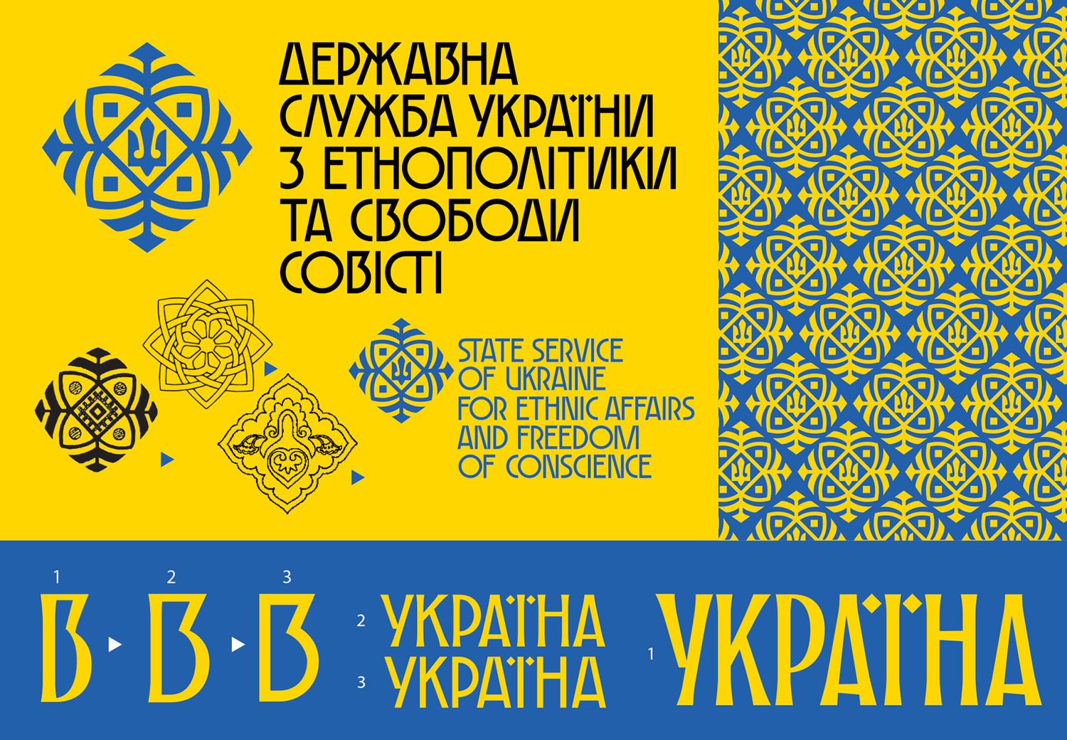
"How do you manage to find the opportunity to create? Isn't it sometimes the feeling that art should now fade into the background, and you are needed more in something else?"
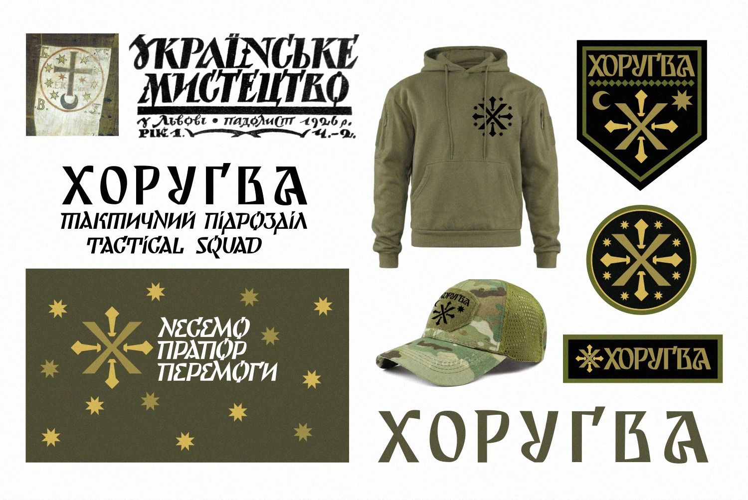
"My brother Anton and I run our own volunteer project. We bring a lot of goodies to the front. I constantly help military units to make them look aesthetically pleasing, and I make designs for battalions. But I still do things that not many people can replace me in. These are projects related to the Ukrainian Church and cultural resistance. This is what I feel is necessary for society. Although I understand that if necessary, I need to put down my computer and pen and go to the army. But while there is a possibility, I am engaged in sensuous warfare and mythodesign. I am eternally grateful to those warriors who give me the opportunity to do this. In particular, to friends-designers who are now defending the country: Lukyan Turetsky, Bohdan Gdal, Taras Ichik, Oleksandr Komyakhov and others.
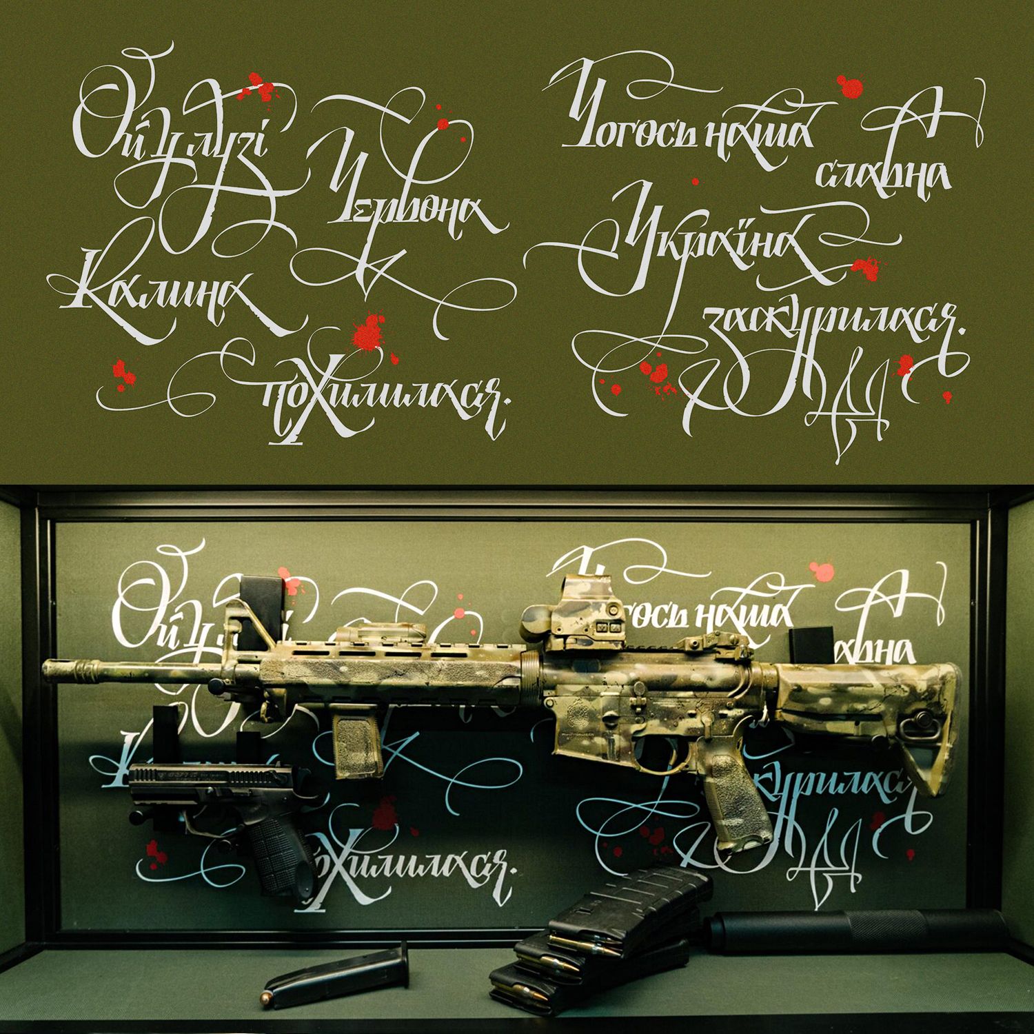
"What do you, as an artist, try to convey to the world in your works?"
"I like those projects when I am addressed as a Ukrainian not because they do it cheaper, faster in Ukraine (as they use Ukrainians of other professions in Europe), but through professional things where I can solve the issue no worse than someone from another country. We need to show that Ukraine can do quite a lot of things for export and constantly increase the list of offers for the world, and not just ask for money or technology.
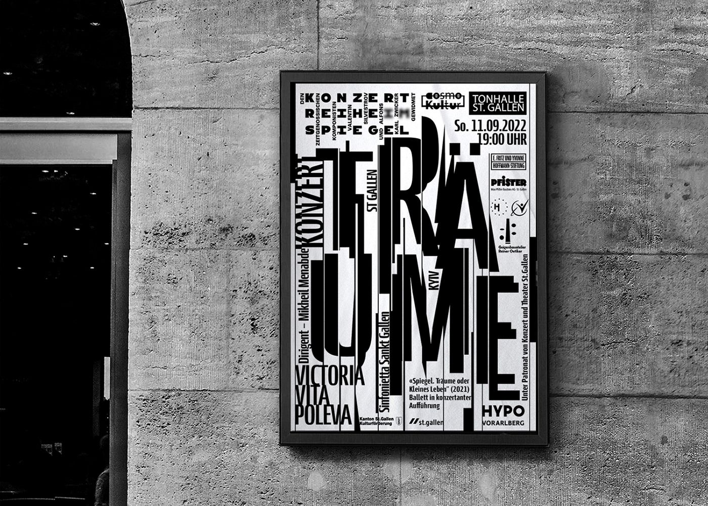
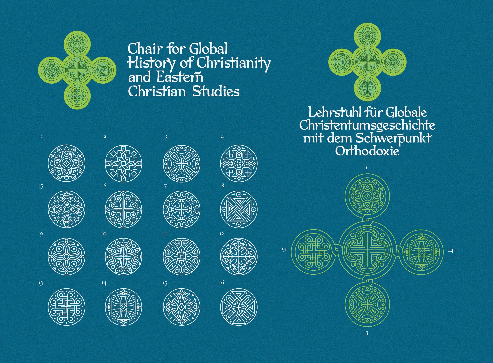
For example, a Swiss customer applies for the design of a festival in Zurich but asks to do it not as if performed by a Swiss — minimalistic and restrained, but as a Ukrainian would do ― with unusual typographic experiments. I had an example when the German University Martin Luther Universität commissioned a department that studies the Christian East. It was a very complex concept, where it was necessary to use the knowledge of sacred art of various Christian traditions but to pack it into a modern combinatorial design.
"Are you currently facing misunderstandings and people's resistance regarding a particular project?"
"We are facing much hate, but I try not to pay attention to what's not important. I talk to specific customers and listen to their requests. The experience of empathy allows you to make a "hit", so my design is accepted. I'm not going to please everyone. I have a certain vision, trying to be different, not even like myself. This is important to me."
"Which of your projects can you call your favorite, iconic?"
"There are significant projects, such as cooperation with the OCU, that will remain for centuries, and there are not very clear to the public, for example, an order from Gorgias Press, a well-known American Oriental publishing house. So, I made the logo in Syrian. That is, there is a person in Ukraine who can do this. In principle, few people in the world make logos in the Syrian language.
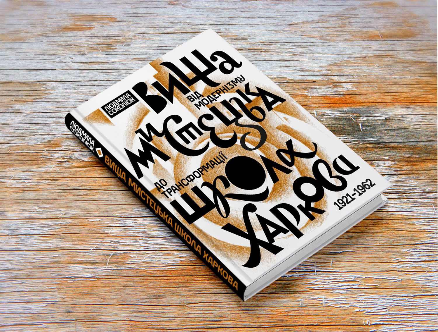
There are very expensive projects for me, for example, the design of a monastery in Rome, calligraphy for Harvard University, and design for scientific conferences in Oxford. I think we managed a lot in book design together with Oleksandr Savchuk. You can see our publications in bookstores. We have given a new trend in the design of books related to the Ukrainian identity. It is better to see my best practices here: www.instagram.com/oleksiy_chekal
"How do you see or would you like to see the development of calligraphy after the end of the war?"
"It is important to teach calligraphy in educational institutions because writing, a sense of proportion, instil taste. And I consider bad taste as a phenomenon to be our second enemy after Muscovy's imperial encroachments on our country. I even gave a lecture at UCU on "Beauty and Bad Taste as a Moral Choice in the Context of National and Religious Narratives". We know the example of Steve Jobs, who, after taking calligraphy courses, understood how important proportions and fonts are in the visual perception of information in the informational space.
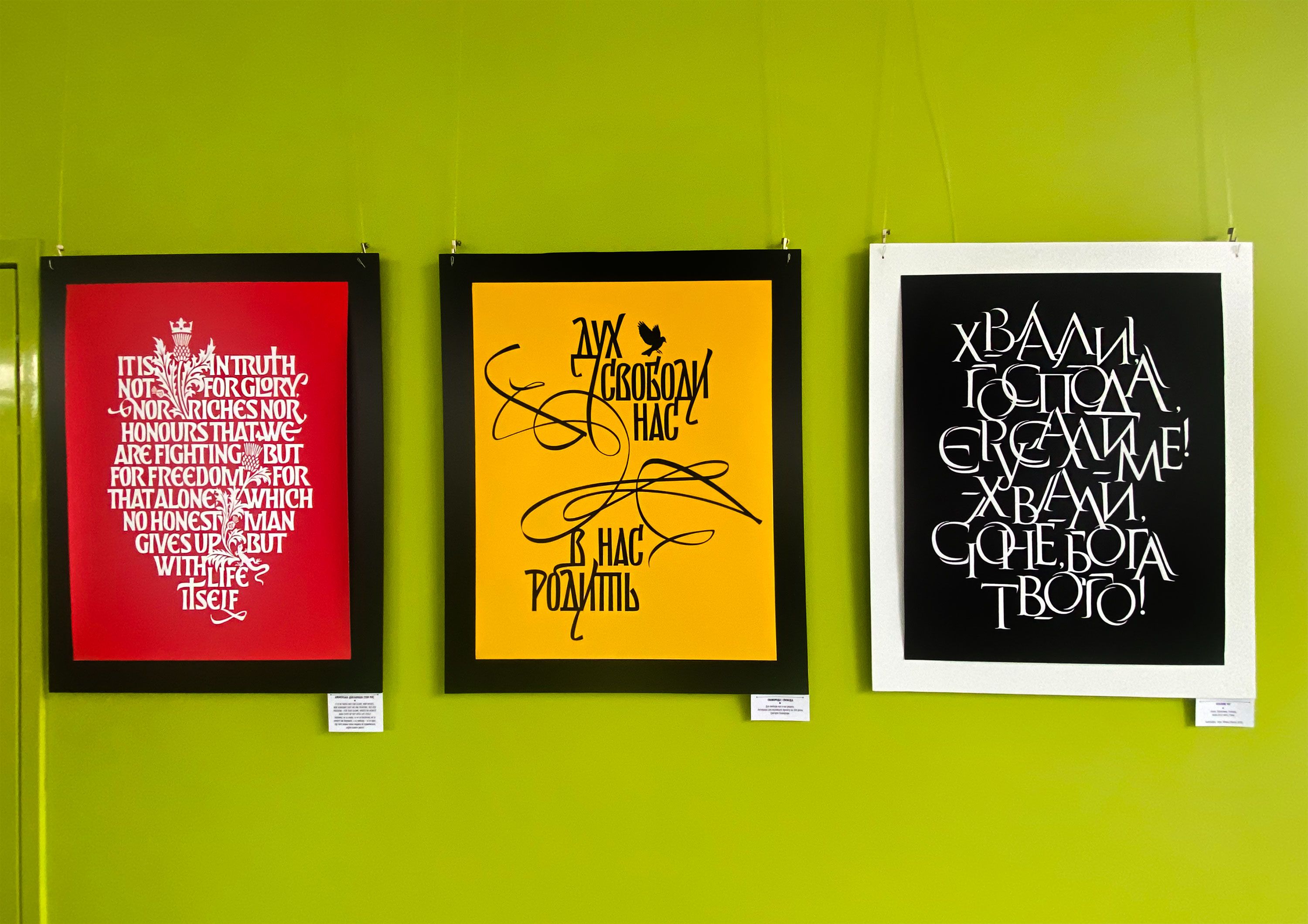
Therefore, in my opinion, it is necessary to hold more typography competitions, festivals, and calligraphy courses, and to take care of the development of typography in general. And, of course, maybe because of this, people will understand that fonts should be bought, not stolen. By the way, you can buy Ukrainian fonts on a more robust service (rentafont.com.ua). After all, behind every font used on a computer, there are many, many hours of work, human lives. A font is the tuning fork of society and history, so we need to nurture and shape it within the context of our culture.
Finally, I would like to rephrase the thoughts of the renowned scholar and Ukrainian studies expert Omeljan Pritsak, who founded the Ukrainian Research Institute at Harvard and whose book of interviews we recently presented at Oleksandr Savchuk's publishing house. Ukraine should be a state of world significance because it lies at the crossroads of geographical roads and historical and cultural paths between East and West. This openness, on the one hand, in serious study of other traditions and deep immersion in the treasures of one's identity, as well as the ability to bravely defend civilizational principles and dignity against the onslaught of barbarians, enable the development not only of statehood or art but also of new values for the world. In this context, the font, design and aesthetics of writing can make a small but important contribution to the processes of reviving Ukrainian consciousness and worldview.
Photos by the author and Oleksiy Chekal
##DONATE_TEXT_BLOCK##


